Upfront pricing for Erectile Dysfunction patients
Lemonaid’s ED service represents a significant chunk of the total business. We were tasked with creating a new optimized flow for our most popular product, sildenafil. Our new flow resulted in lowering the cpa by ~ 50%!
ObjectiveRedesign Erectile Dysfunction service to lower CPA & increase sildenafil orders
TeamProduct Design Lead - myself
Eng team - CTO, 4 developers, 3 QA
ProcessCompetitive analysis- We reviewed major competitors: Hims & Romans
User research - We surveyed men ages 25-72 who expressed interest in buying ED meds (usertesting.com)
Wireframes, user testing, mock-ups
Launch, measure & refine
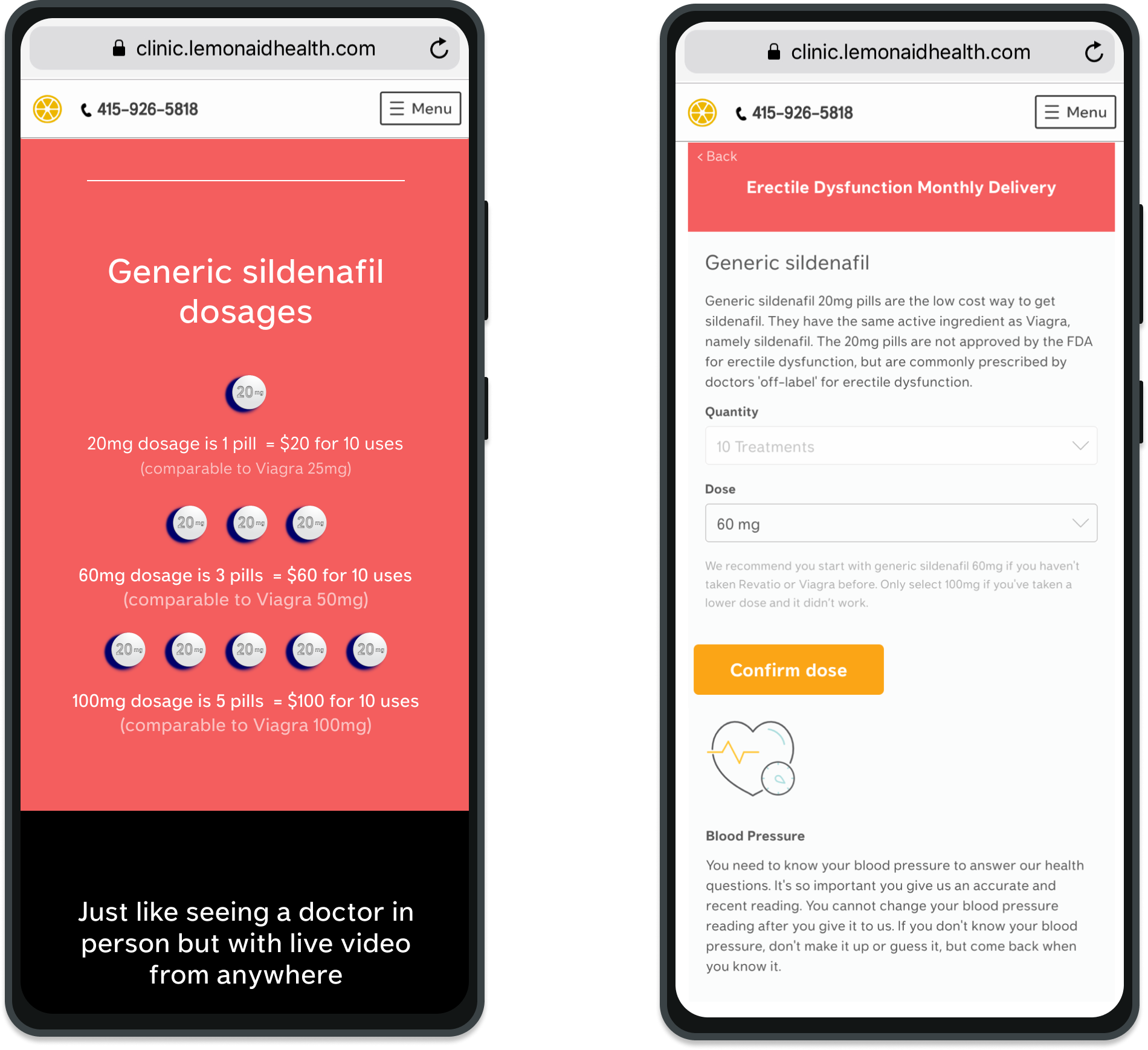
ProblemPrice sensitive users don’t understand what they’re getting from our service.
“This stuff about 60mg or 100mg — I don’t know what that means.”
“What do they mean by treatment? Is that 1 bottle?”
“Would you divide by thirds? Not sure on the math on that one.”
"How many f*cks do I get in a bottle?”
Old design: landing page graphic & dose selection page
SolutionNew price breakdown page at the top of the funnel
We took this idea from our competitor and tested their site as well with users. The results confirmed that men looking for ED meds online preferred an upfront, clear price breakdown. Users reported that although they liked our competitor’s page, the breakdown didn’t clarify enough details on pricing. I incorporated their feedback into the design.
Learning from successes in marketing, we decided to simplify the communication by just displaying the number of pills and defaulting to the most common number used to achieve the most common dose. We also provided a tool tip for a more in depth explanation. We replaced words like ‘treatment’ and ‘uses’ with more explicit language, ‘sex sessions’.
Should users choose the number of pills? We decided to A/B test
We weren’t sure if we should allow users to choose the number of pills. We imagined that experienced users would be familiar with the drug and want to choose the dose that works for them. If users selected the appropriate dose, their exchange with the clinicians would be more efficient. We displayed some copy reading ‘most popular’ for users that didn’t know.
Version 1 of price detail page used for A/B test
CVR was the same for A & B but we decided to remove the choice since patients were not choosing the appropriate dose.
Consistent with user testing, patients truly didn’t understand that more pills = higher dose per sex session so they often chose more pills in order to get a better deal from the first time discount. Our clinicians requested that we remove the option to choose since this was making their workflow less efficient.
Design note‘Fake checkout page’ design critique
I quickly received feedback that my design looked like a ‘fake checkout page’ Our service was doing really well (so well that we added another drug option) so I couldn’t justify redesigning the page.
Instead, when it was time to improve our Cialis Daily flow, I designed a similar page with a different layout to experiment.
Interestingly, we saw no difference in drop-off rates between either page.
Sildenafil price detail page vs Cialis Daily price detail page
Measuring success and next steps
The CPA improvement was a big win and our ED service, along with a few others helped us to secure series B fundraising.
2 or so years later, the market is different now for ED meds online and our competitors have evolved as well. I think it makes sense to talk to our patients and run our current flow through a similar process to understand what’s changed.


