Improving relationship with customersRedesign messaging experience
As the business moves away from a transactional ‘get your prescription and come back a year later for refills’ model, we needed to provide a more personal and exceptional messaging experience to facilitate strong relationships with patients.
Overarching goalProvide essential messaging features for coaching customers & improve retention for all patients.
TeamLead Designer - myself
Product Manager
API engineer
App & Web development teams
ProcessDesign explorations
Competitive research
Extensive user testing with prototypes
User flows
Collaboration with department heads
Design Timeline: 2 weeks
problemCoaching clients feel uncomfortable sending personal messages
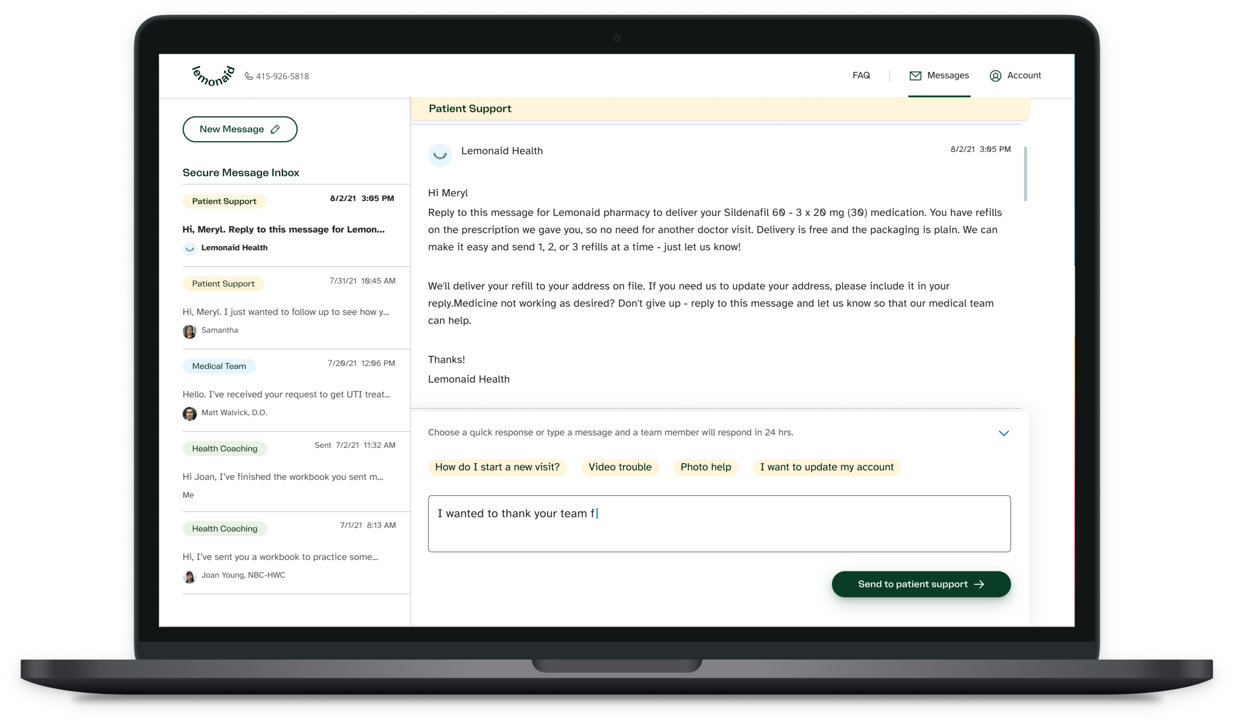
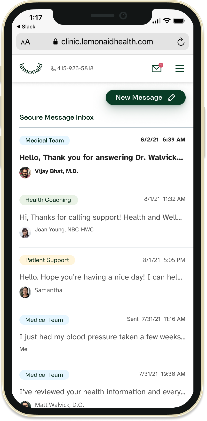
Our messaging platform displays one common thread per customer and everyone on the team can see and respond to any message. The screen also suffers from some usability issues. It opens with the text field at the bottom wasting space and requiring patients to scroll to read the most recent message.
Our business model depends on any available clinician replying to patients. There is no 1:1 ongoing doctor - patient communication.
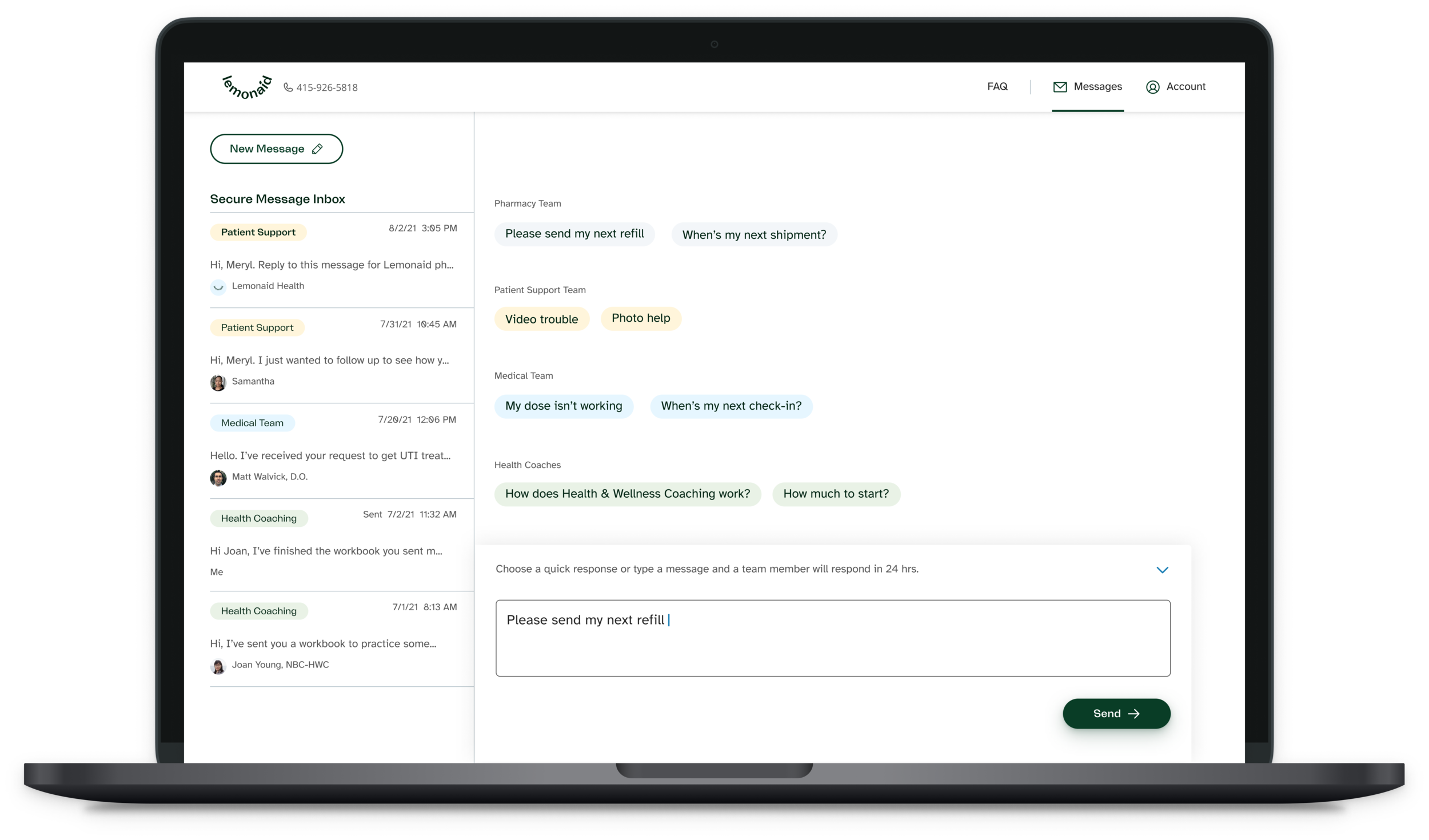
SolutionUtilize categorization process to display threads by team
In order to efficiently respond to patients, our team relies on a system where each message is assigned a category through keywords or manual intervention. Each team is responsible for specific categories with very little crossover.
Working with our patient support, clinical and pharmacy teams, I designed a system where each category is assigned to a team ‘bucket’. These ‘buckets’ determine how the message is displayed.
Team ‘buckets’ will preserve the flexibility of one thread (messages can still be sorted into different categories) but provide a better experience for the customer.
Design NoteText or email? We decided on a hybrid
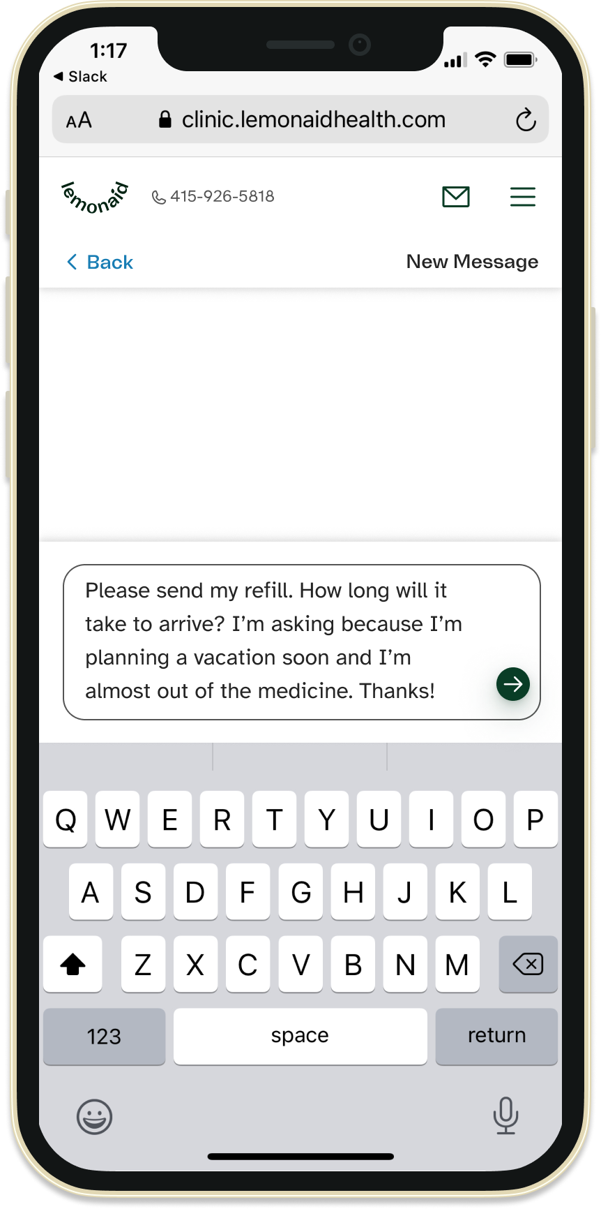
Roughly half of users reported that the design reminded them of email and the other half reminded them of text messages. At first, I was uncomfortable with this so I drafted an email version and a text version for review.
Email design cons
Extra click/ tap to reply
Too formal for Health Coaching or therapy relationship
Text design cons
Too casual for doctor/patient communications
Gives impression of immediate response
Needs to look good on desktop screens


User test hypothesisUsers will send messages to the appropriate team with the new design
Besides usability, I was testing to see if users would choose the correct team or bucket when sending a message.
I instructed users to read a message from a Health & Wellness Coach and imagine that they suddenly remembered an important question about side effects to ask the medical team. I tested multiple design variations and only achieved 50% adherence at best!
Take awayWe can’t rely on users to self-categorize
Although Test B had a better adherence rate, we decided that it was essential to display a snippet of the message since users rely on refill reminders to order refills. Plus, every messaging app, email and text, display partial messages on the home screen. I hypothesized that as the system sorts their messages into the correct threads over time, patients may learn to send messages to the appropriate team successfully.
Integrating with a current framework: user flows Next steps and success metrics
I’ll know the true success of this design after it’s released and we start hearing from patients. I would love to reach out to patients and observe how they navigate the new experience. We’ll also track number of messages sent and response rates to see if those are impacted.
Our most important metric will be Health & Wellness coaching retention rates & feedback but we will also track overall patient retention given the new experience will touch every patient.


