Expanding to the U.K.Partner with Boots Pharmacy to open Online Doctor website in the U.K.
We partnered with Boots Pharmacy to create a stand alone online doctor website with 45+ services. We built an entire website from scratch in 3 months.
Overarching goal:Provide a comprehensive primary care service
Design Team:Lead Product Designer - myself
Marketing Designer
UI/UX Designer (contract)
Timeline: ~3 months
Process:Quickly develop a UI Kit/ DMS
Prototype example flows for demonstration
Collaborate extensively with Boots product and brand teams
Review U.K. competitors
Design templates that can accommodate multiple services
Problem:Build 45+ health services from scratch
How can we design a system that accommodates all services ranging from Thyroid at-home test kits to Hair Loss treatment and more?
In order to out pace competitors, Boots wanted to launch with over 45 services.
Solution:Instead of unique flows, build templates that work for multiple health services.
At first, I started mapping out templates by key features but I quickly realized there would be too many variations to track and design for. We decided to look at the most impactful feature: Can the patient choose their medicine in the flow or not? We divided the health services into these 2 buckets and built the screens for one group at a time. We relied on existing functionality and flow structure from Lemonaid Health in order to scale so many health services so quickly.
Example landing pages & medicine selection pageNon choose drug
Choose drug
UX trade-offs in order to scale
In order to meet our deadline, we had to be extremely strict about not customizing any feature for a specific service. For example, our Erectile Dysfunction service provides different prices per qty and doses but our Birth Control service is always the same quantity and usually the same dose. We had to accept the fact that our ED Choose medicine flow would to have to display a line item for each version of medicine so that the same template could accommodate all other flows.
To mitigate the pain of scrolling through 40-50 list items, I designed a promoted list which only displays the most popular 5 options. The user can click/tap to explore the full list.
We’ve made plans to launch a custom choose medicine flow for ED in V2.
design ProcessBuild out design management system & map out user flows
Spacing rules, layouts, typography, color and all other building blocks necessary for the website. We referenced Atomic Design.
Additionally, I mapped out a birds eye view of the flows (based on Lemonaid Health’s architecture) with all possible features.
Work with marketing designer to create asset library
We developed icons, illustrations & photography
Boots provided a design guide where different colors were assigned to service categories. We decided to carry the each color theme throughout the entire flow.
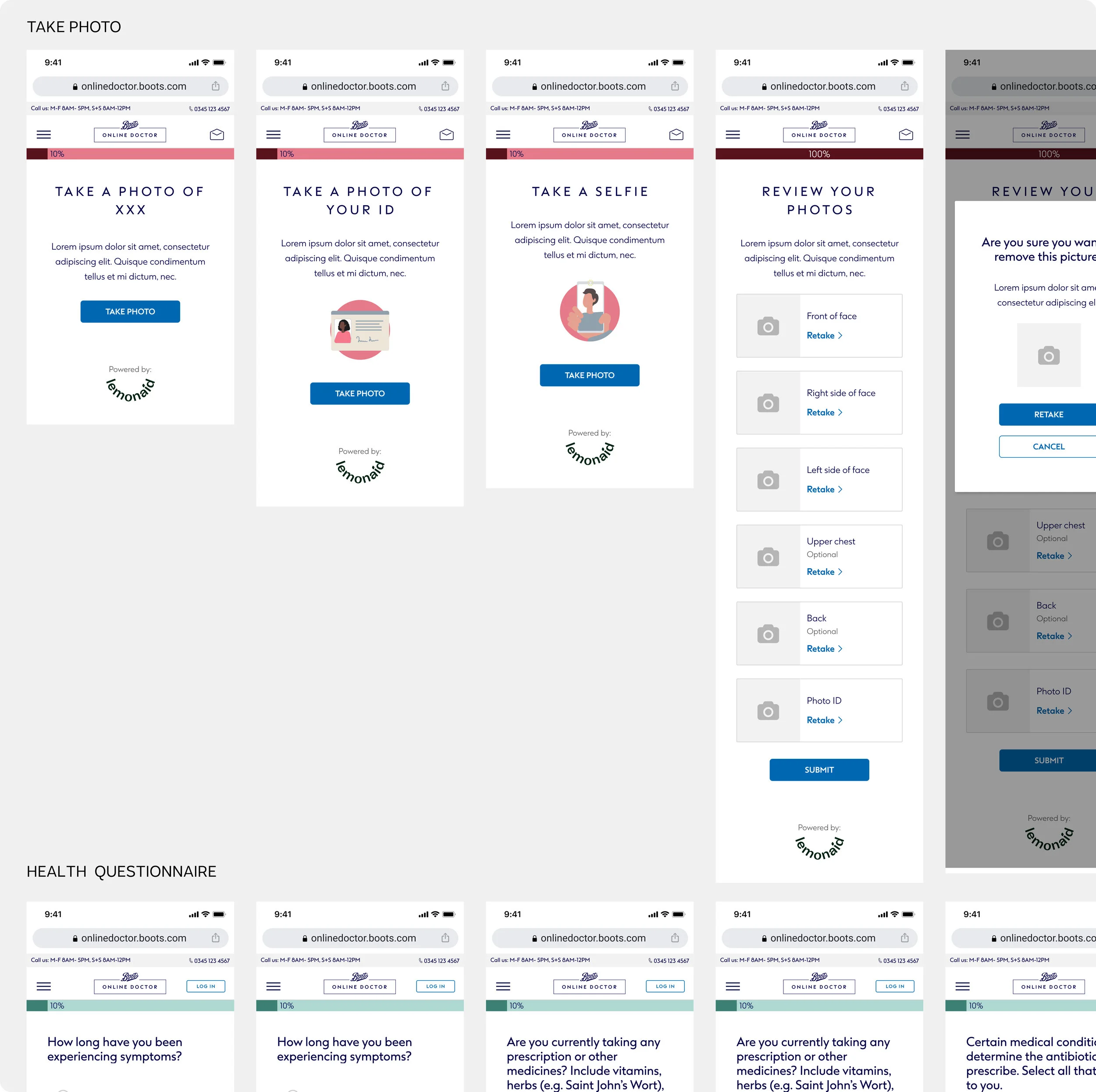
Deliver all screens, one feature at a time
We generated all screen templates in both mobile and desktop.
Success metrics
We launched on time and Boots was very impressed.
We saw a healthy treatment rate which means users are successfully completing the flow and speaking with a doctor.
Next steps
This was an amazing exercise in building a design system to scale quickly. We utilized our experience, the established product flow from lemonaid and best practices to provide the most user friendly experience possible. However, given users in the U.K. have easier access to national health care, there are surely gaps we overlooked.
I’d like to reach out to users that both completed a flow and abandoned and get a sense of their needs, why they chose to pay for something they can get for free and what other values our product provides besides the obvious ones.


